
QUEST FOR THE QUILL
Quest for the Quill is the most involved Illustration project I've creatively directed to date. The above game board was designed as a way to bring further student engagement for Art of Problem Solving's Language Art's short story competitions happening in the fall. Previous competitions showcased only a leader board with numbers dictating student's progress along the competitions, with no real payoff or award ceremony. Quest for the Quill sought to place students in a journey across the land of Enaris: a space ripped apart by a black hole where all manner of stories are converging in one single landmass.
As each Academy campus advances, they move ahead along the numbered path on the board which leads to the magical Quill at the center. Along the way they encounter different settings that hearken back to all the stories they have read during their courses, while being overseen by the three sages of writing at the maps' corners. This project was a huge challenge in incorporating brand, lore, and function into one cohesive piece that could be used perpetually by AoPS Academy campuses across the nation. Beyond the map, I also had to illustrate several accompanying pieces such as medals, bookmarks, and puzzle book illustrations which aided the marketing efforts of our new take on our Language Arts short story competitions.
Creative Direction & Illustration by:
Nestor Tomaselli, Liza Marino
Graphic Design Mock Ups by:
Liza Marino
Language Arts Leadership Team:
Jack Sanchez
Matthew Underwood
Dane Scott
FONTS & COLOR CODES
Main Copy - Alchemist
ABCDEFGHIJKLMNOPQRSTUVWXYZ
abcdefghijklmnopqrstuvwxyz
Accents - Grusskarten
ABCDEFGHIJKLMNOPQRSTUVWXYZ
abcdefghijklmnopqrstuvwxyz
Color Codes
#E8B70D
#F04E29
#6FACC5
#A400A4
#6B9B3B
MOODBOARD

DESIGN MOCK UPS

SKETCH, LINEART, COLOR
Regardless of it's massive size, every great idea starts off with a sketch. After putting together the above seen design mock-ups with our graphic designer, Liza Marino, I set off illustrating the foundations of Enaris, basing myself on the hexagon as the main shape for the landmass. The idea here was to have the centerpiece hearken back to the hexagon seen on Art of Problem Solving's logo, and thus have this seemingly intricate world be identifiable with the brand. I also included hexagon - based patterns around the edges to tie things back to our core institution which focuses learning via problem solving.
Inscribed in golden script as the sides is the language of Enaris, which poses a puzzle of its own. Along with the map, students are given a key with Enaric letters next to English letters, and part of advancing along the map involves the students deciphering what is being said in Enaric along the map's borders. The idea here was to make the world feel alive for the students while also teaching them how to solve problems and think critically in the lingo of Language Arts.

PUZZLES & ISOLATED ASSETS
These illustrations were painted for separate puzzle handouts given to the students so that they could train their language skills. The main protagonists of these puzzles can also be seen as the three sages in the game board above: Sage Dayspring (maagenta robe), Sage Noontide (orange robe), and Sage Gloaming (black robe). Each represents a different time of the day or a different moment in a story's timeline: day, noon, and night, or the beginning, middle, and end of any narrative. Along with these I also helped to re-draw some characters from an Art of Problem Solving original story called Wondermoore, and re-contextualize them in the layout of these puzzles. Some other assets seen below were pulled directly from the map to be used as stickers, t-shirt designs, and more.
I worked alongside our graphic designer, Liza Marino, to lay these out on Canva templates that could be easily re-used and re-purposed by educators to suit their needs.

QUEST MEDALS

STUDENT BOOKMARKS


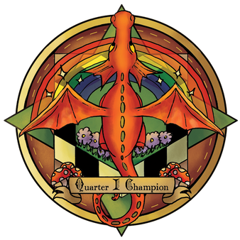
The medal designs and bookmarks seen below were created to give students a physical memorabilia of Enaris, while also properly commemorating the "Quest Champions" of our Language Arts contests. The main design was again based off our main company logo, with actual single-tone copies of said logo included along the medal's ribbons. The bookmarks below were made from different illustrated fragments from the map, with bits of lore added to give the students a sense of intrigue and wonder.
CAMPUS INSTALLATION
The final piece of this gargantuan puzzle left our hands and came down to each of the campus directors, who were given a set of materials to install their game boards & adjacent placards for students to make use of. A sample of our printed medals can also be appreciated below. This came as a big test for us designers as we had to ensure every single piece was sent in the right size, color code, and printing format - and the final results turned out to be immaculate, with the joy of our educators being the greatest source of satisfaction.


